Systems Design at SAP: Scaling Impact
The Story
Picture this: You're working at SAP, surrounded by brilliant engineers building some of the most powerful analytics tools in the world. SAP Analytics Cloud, SAP HANA Cloud, SAP Data Warehouse Cloud—all incredibly smart products. But here's the thing: they all felt like they were designed by different companies.
Users would jump from one H&A application to another and suddenly feel lost. "Wait, where did that button go?" "Why does this table work differently?" It was like walking into different rooms of a house where each room was decorated by a different person with completely different taste.
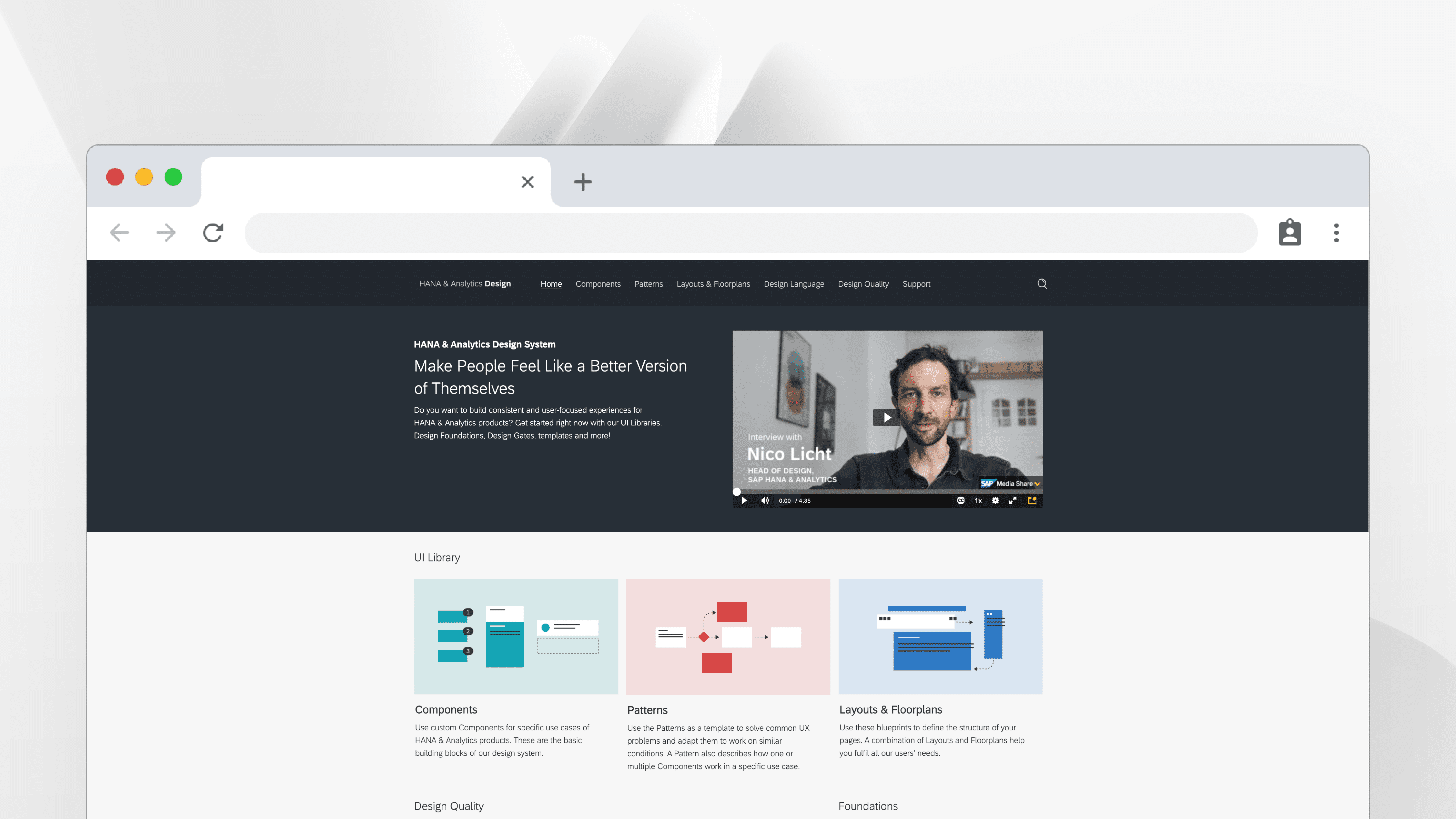
So the team decided: we need a design system. Not just any design system—one that could wrangle these complex enterprise beasts into a cohesive family while still playing nice with SAP Fiori (the company's main design language).
And somehow, I got to be the one figuring out how to make this happen.
What I Actually Did

The Detective Work
First, I became a design detective. I interviewed every product designer I could find who "owned" different spaces. Think of it as speed dating, but instead of looking for romance, I was hunting for patterns, pain points, and "why the hell did we build it this way?" moments.
The Translation Game
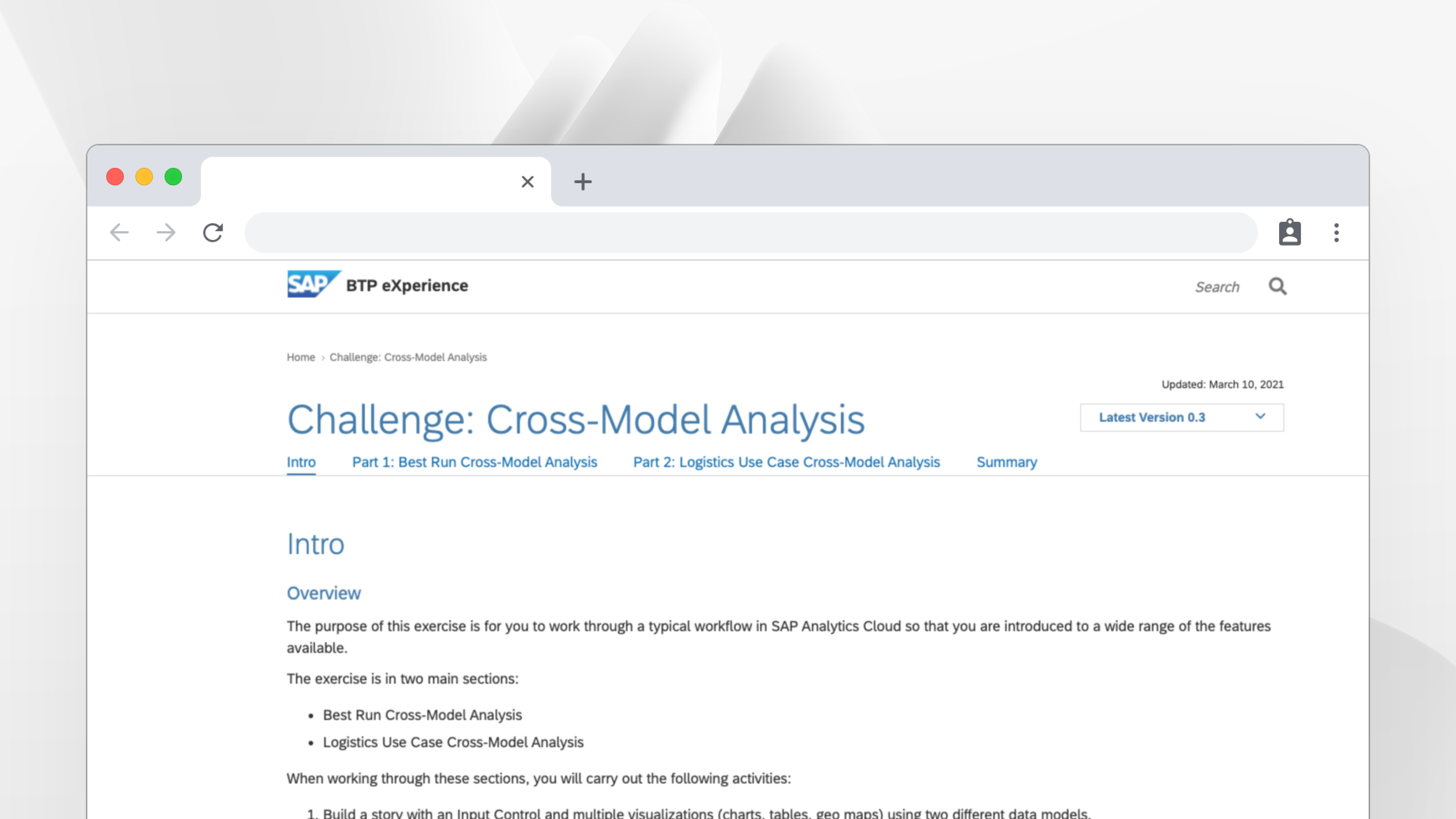
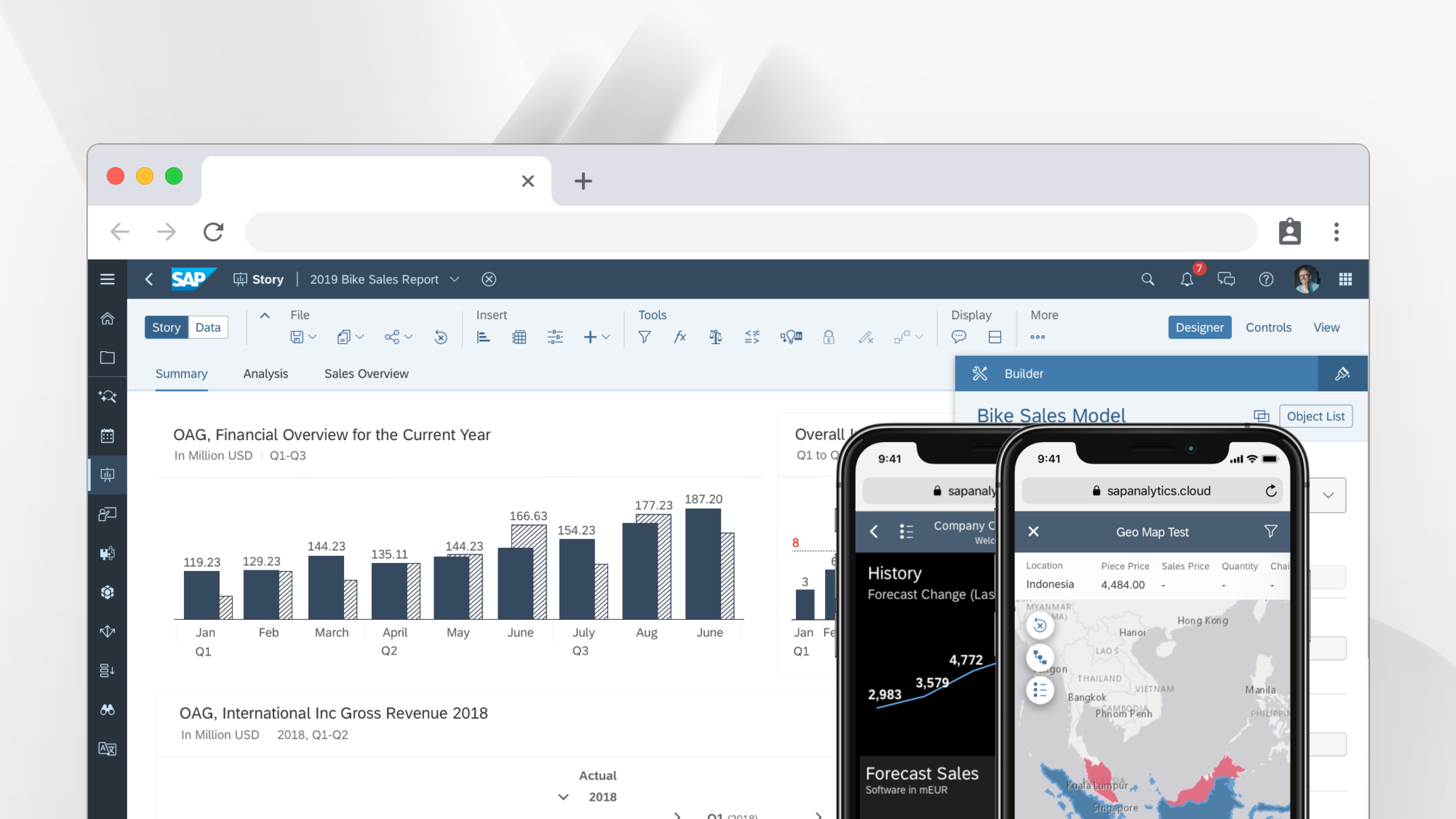
Then came the fun part: turning complex technical requirements into something that actually made sense. I wrote guidelines for the fundamental building blocks—canvas, table, calendar, and object page layouts. Basically, the LEGO pieces that every H&A screen would be built from.
The tricky bit? Figuring out what we could steal (I mean, "inherit") from SAP Fiori versus what needed to be built from scratch. It's like cooking—some ingredients you can buy pre-made, others you have to make yourself because nobody else makes them quite right.
The Collaboration Marathon
I spent my days in endless (but actually productive) meetings with senior designers, stakeholders, and anyone who had opinions about how enterprise software should work. Pro tip: everyone has opinions about enterprise software.
The Real Challenge
Here's what nobody tells you about design systems in big companies: the hardest part isn't designing the components. It's getting everyone to agree on what "good" looks like when you're dealing with applications that handle millions of data points and need to work for analysts in Tokyo, developers in Berlin, and executives in New York.
Every guideline had to answer: "But what about when users need to...?" followed by increasingly complex edge cases that would make your head spin.
What Came Out of It
The floor-plan guidelines became the foundation for every new screen across H&A products. Teams finally had a playbook that said "when you're building a data table, here's how to do it" or "when you need a flexible layout, here's your canvas pattern."
Did it solve world hunger? No. Did it make life easier for dozens of designers and thousands of users navigating complex analytics tools? I'd like to think so.
Behind the Scenes
Day-to-day reality:
Coffee chats with designers who knew where all the design skeletons were buried
Writing guidelines that needed to be detailed enough to be useful but flexible enough to not be annoying
Presenting to stakeholders and trying to explain why consistency matters (spoiler: it always does)
Lots of "what if" scenarios and "but in Germany they do it differently" conversations
The Fine Print
The work samples shown are simplified versions to protect proprietary information. Want to see the real stuff and hear about the time we spent three hours debating the perfect spacing for table headers? Let's grab coffee and I'll tell you everything.
PS: Enterprise design systems are like icebergs—90% of the interesting work happens behind the scenes. But that's where the real magic happens.